Join a community of the most creative Business Intelligence Professionals
Join a community of the most creative Business Intelligence Professionals
View the DataDNA Data Visualisation portfolios below
Browse AI-reviewed portfolios from our global community of data professionals
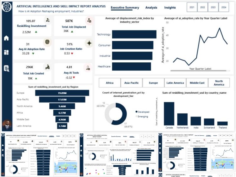
Approach: I built an end-to-end analytics pipeline: cleaned and validated the data (by hand, built a star-schema model linking the...
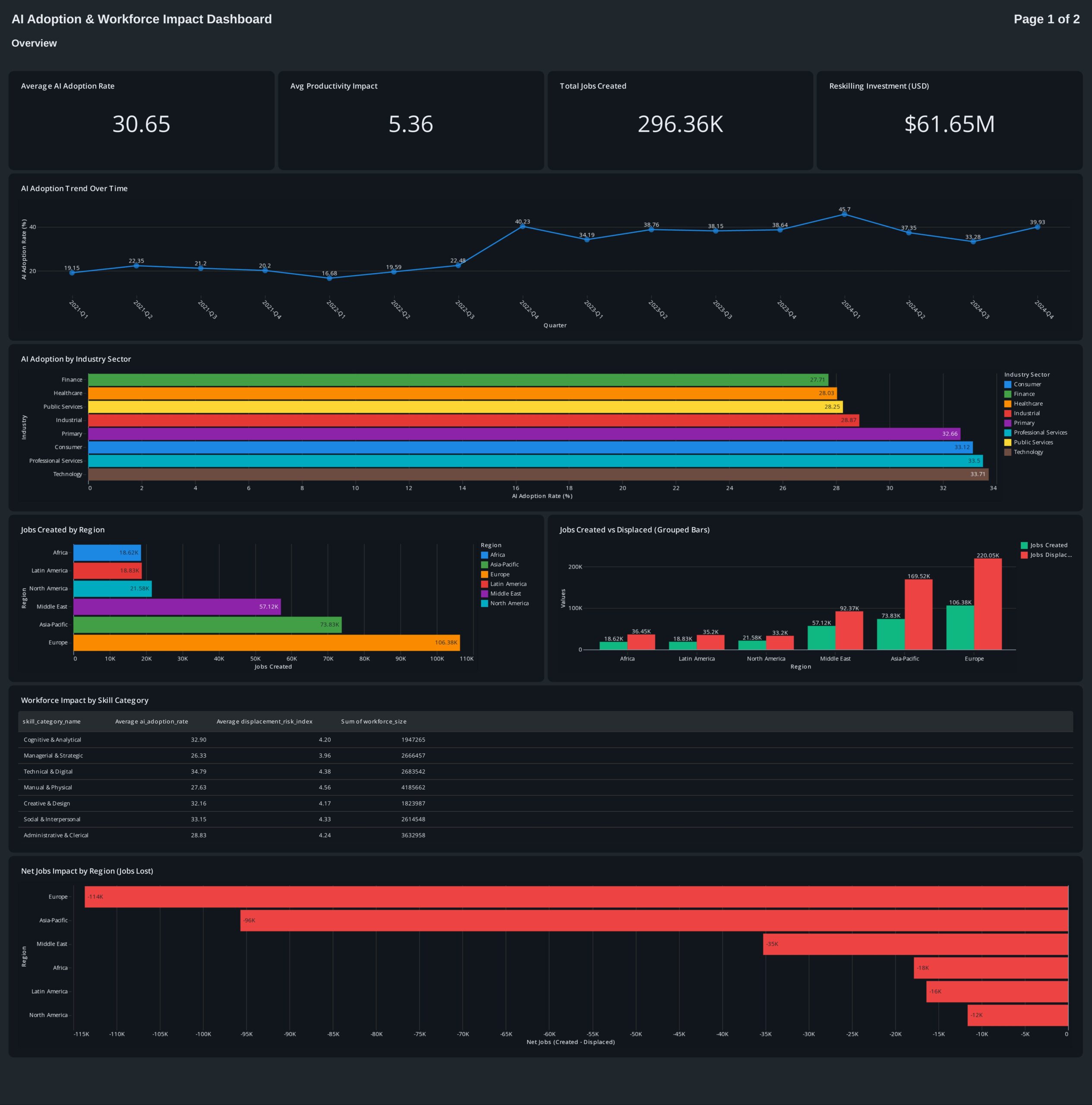
I have created this dashboard in Databricks . I also took help from Genie space
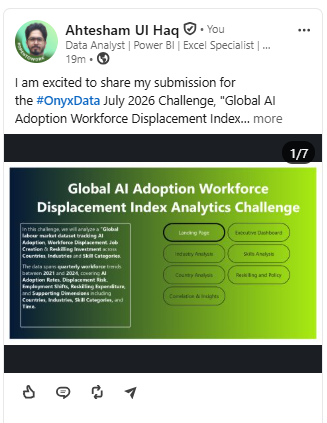
I have reviewed the 4 csv files provided, breakdown it and calculated measures through DAX measures and calculated columns.
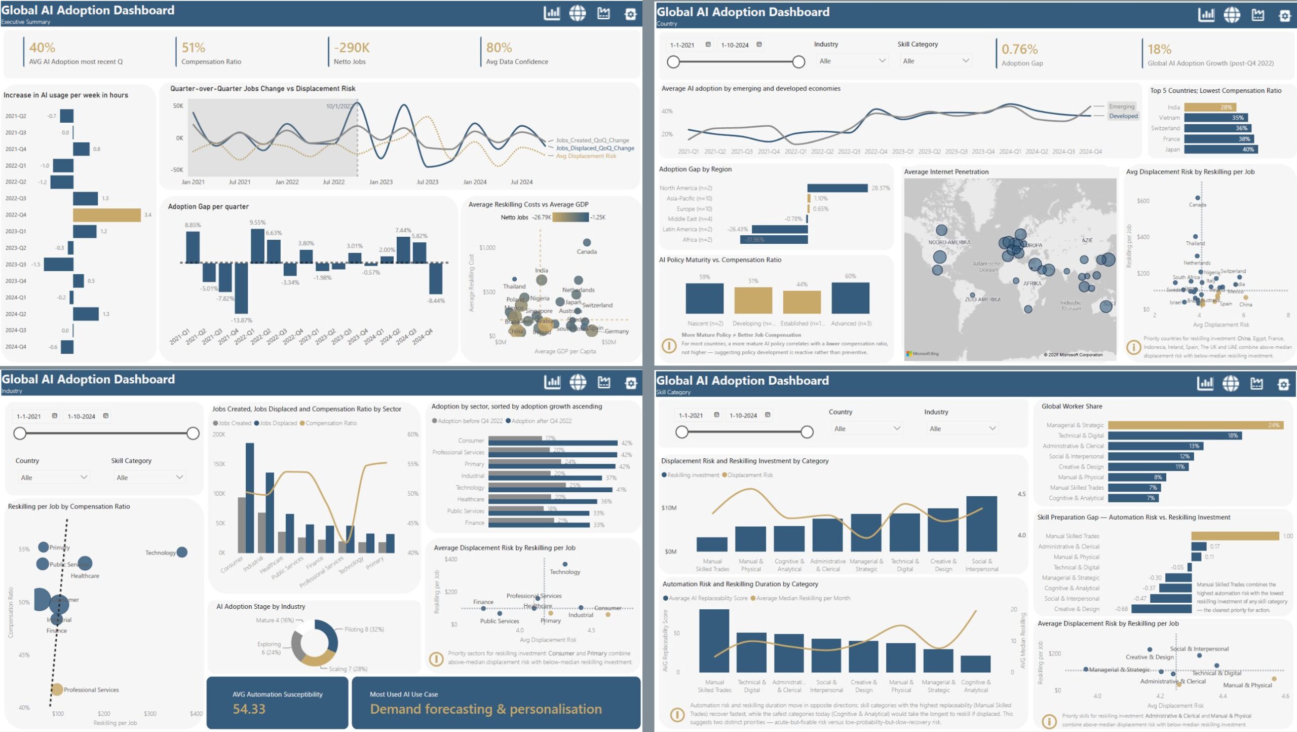
Spent this month’s Onyx Data DataDNA Challenge inside four years of global workforce data — 30 countries, 25 industries, 8...
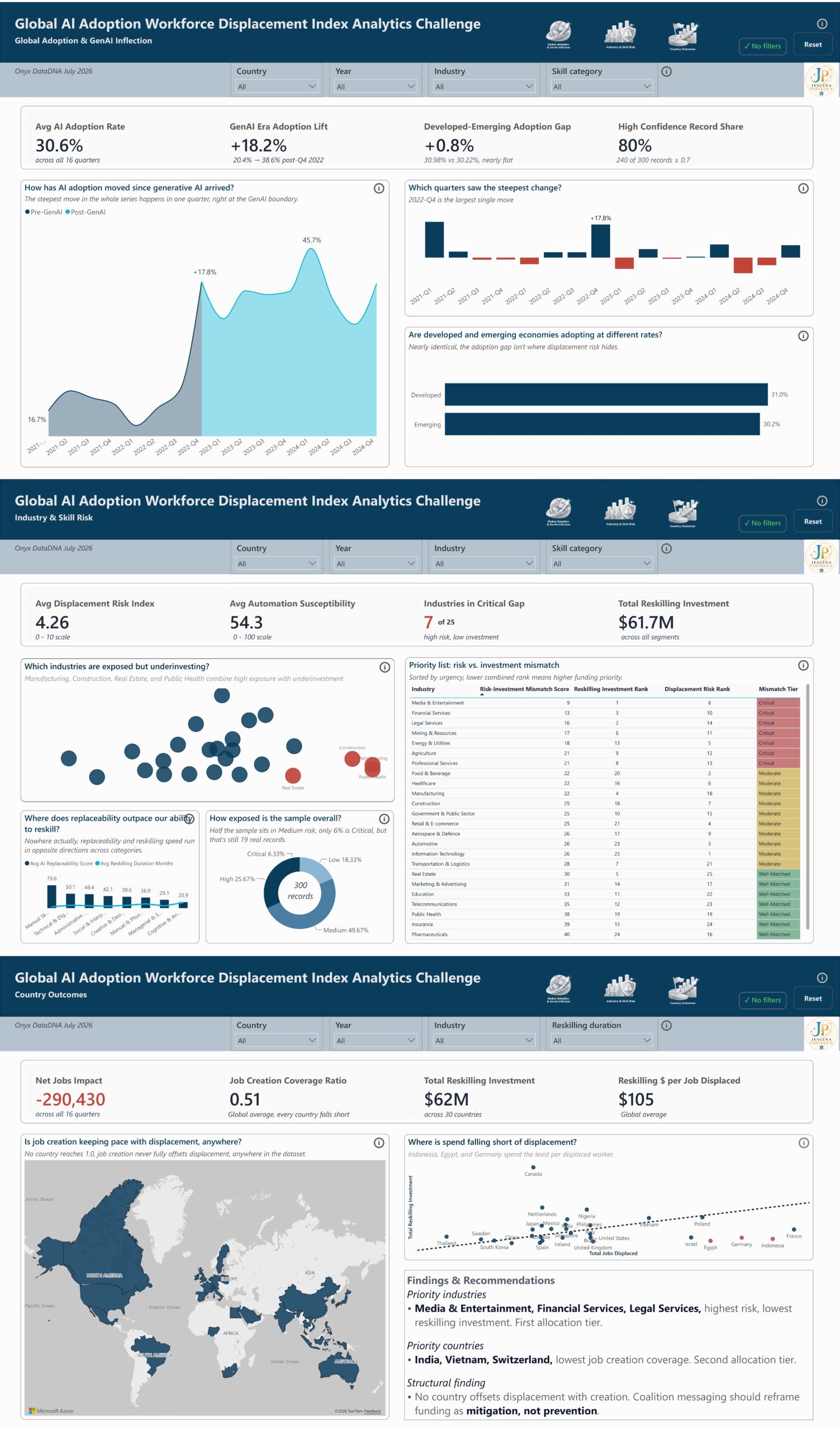
Before building a single chart, I checked how much of the data I could actually trust. That’s usually where I...
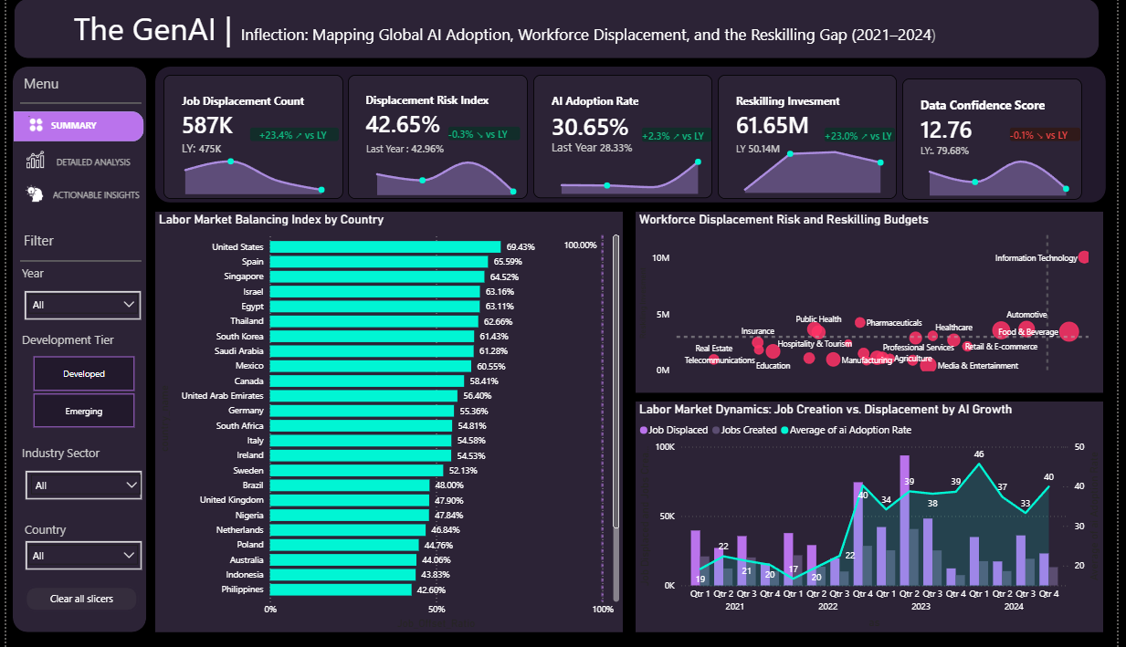
Project Overview: An executive-level dashboard created for the Onyx Data DNA Challenge to analyze the intersection of global AI adoption,...
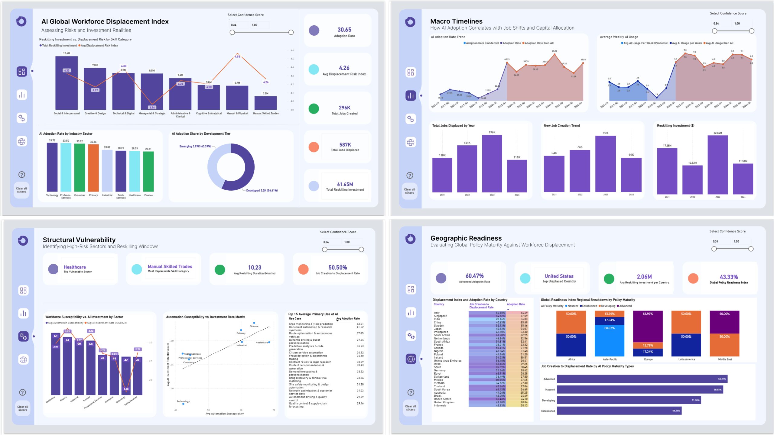
Here are my key takeaways from this analysis: Global industries are heavily prioritizing human-centric skills, pouring a massive 297.48% more...
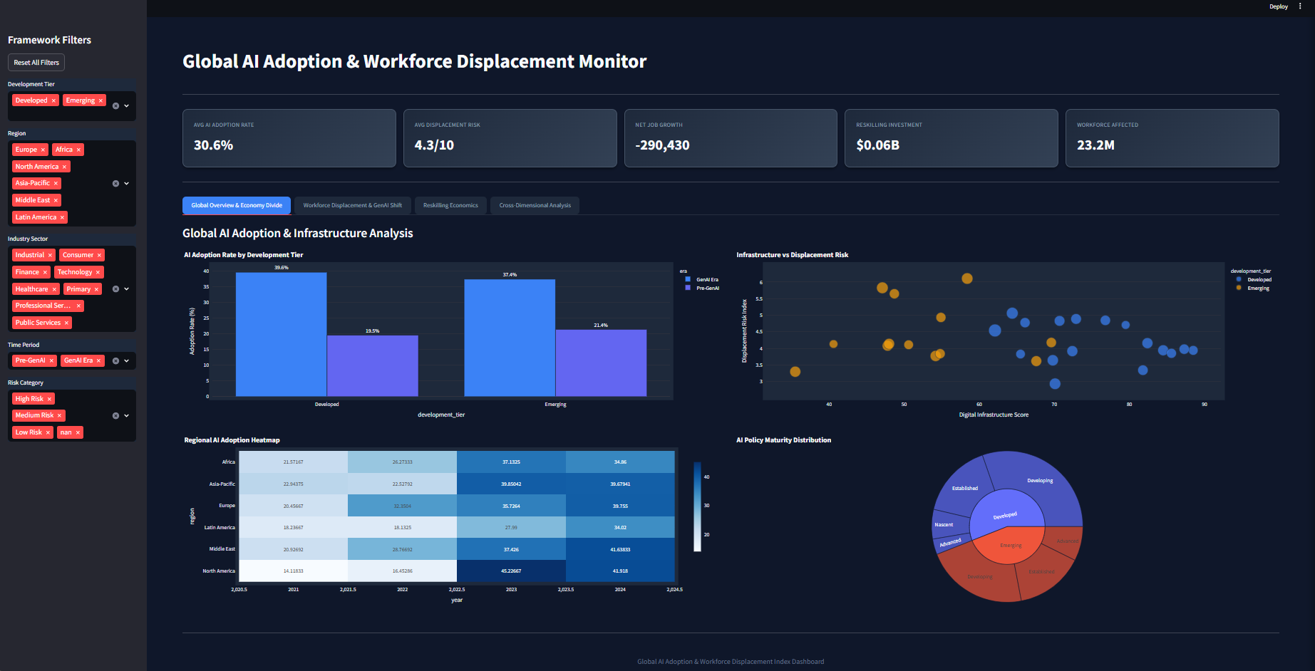
Interactive dashboard analyzing Global AI Adoption Workforce Displacement Index using Python, Streamlit, and Matplotlib. Explores AI’s impact on workforce dynamics...
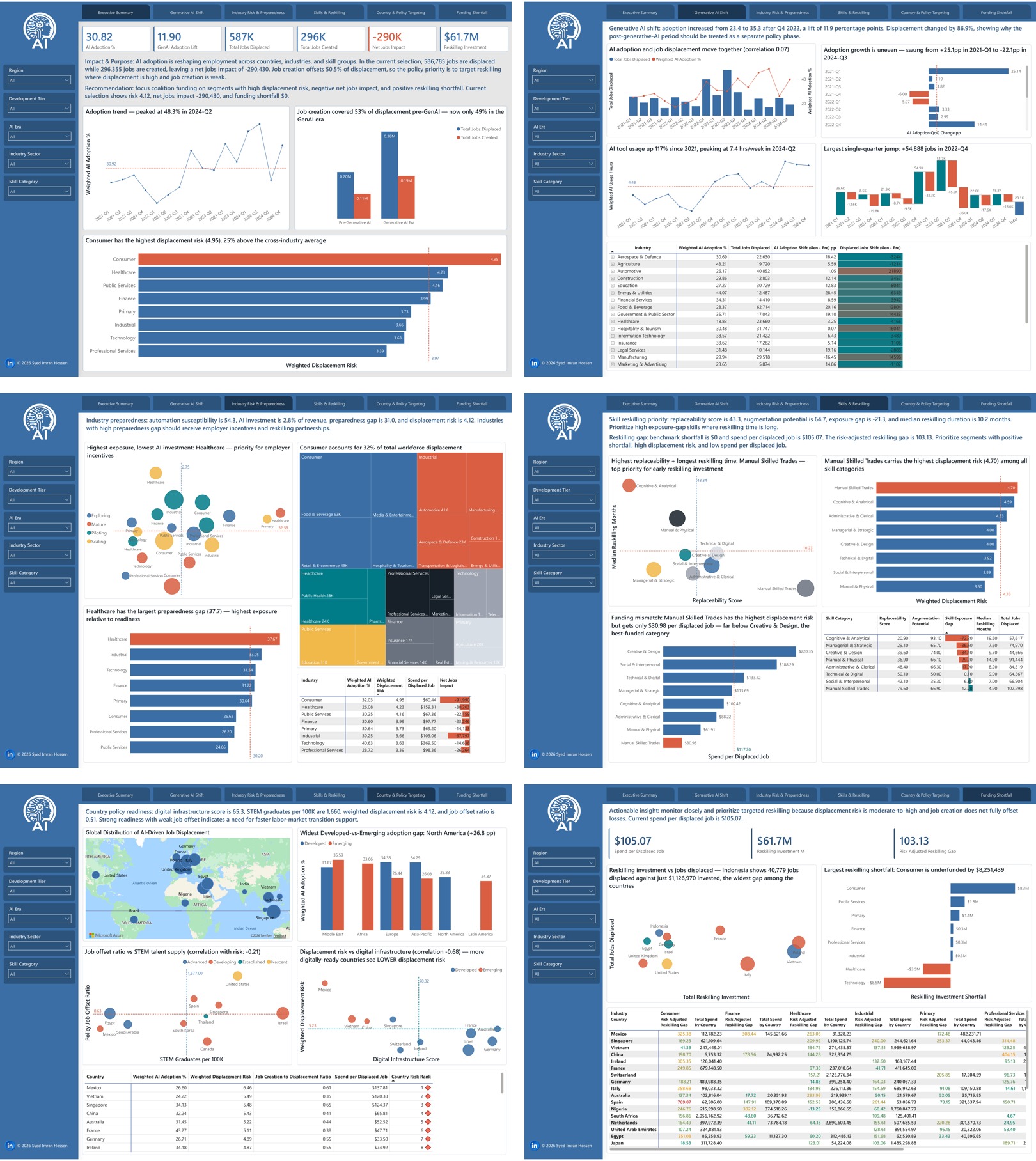
A few things that stood out while building it: → Job creation covered ~55% of displacement pre-GenAI. In the GenAI...
Discover the latest AI & Data challenges

 Get In Touch
Contact our team

16 Upper Woburn Place, London, Greater London, WC1H 0AF, United Kingdom