July 2026 DataDNA – Global AI Adoption Workforce Displacement Index Analytics Challenge
July 2026
In this challenge, you will analyze a global labour market dataset tracking AI adoption, workforce displacement, job creation, and reskilling investment across countries, industries, and skill categories. The data spans quarterly workforce trends between 2021 and 2024, covering AI adoption rates, displacement risk, employment shifts, reskilling expenditure, and supporting dimensions including countries, industries, skill categories, and time.
Your objective is to uncover how artificial intelligence is reshaping the global workforce, identify industries and skills most vulnerable to AI-driven disruption, evaluate whether reskilling investment is keeping pace with workforce displacement, and highlight where governments and policymakers should prioritise intervention to build a more resilient future workforce through data-driven decision making.
View Details
June 2026 DataDNA – UK Fintech Neobank Digital Transaction Health Monitor Analytics Challenge
June 2026
In this challenge, you will analyze a transactional dataset from a UK-based fintech neobank tracking customer activity, transaction performance, fraud exposure, and fee revenue across digital banking channels. The data spans individual transactions, customer profiles, transaction types, merchant categories, and supporting dimensions including regions, devices, channels, and KYC status.
Your objective is to uncover revenue opportunities, identify fraud and operational risks, and detect customer behaviour patterns — helping Risk, Finance, Product, and Compliance teams improve transaction success rates, reduce revenue leakage, strengthen fraud controls, and enhance the overall customer experience through data-driven decisions.
View Details
May 2026 DataDNA – Music Streaming Platform Performance Analytics Challenge
May 2026
In this challenge, you will analyze an operational dataset from a mid-sized music streaming platform tracking user behaviour, content performance, and subscription activity across multiple markets. The data spans listening sessions, subscription lifecycle events, and supporting dimensions including users, artists, tracks, genres, devices, and geography.
Your objective is to uncover growth opportunities, identify churn risks, and detect behavioural patterns — helping leadership increase retention, optimise revenue streams, and improve user engagement through data-driven decisions.
View Details
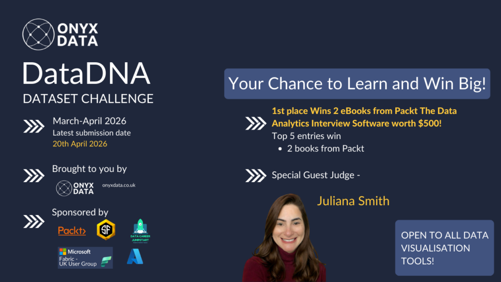
March-April 2026 DataDNA – International Maritime Logistics & Terminal Efficiency Analytics Challenge
April 2026
In this challenge, you will analyze an operational dataset from a global maritime logistics company managing cargo movements across international terminals. The data includes cargo transactions by terminal and vessel, with supporting dimensions for time, regional hub (EMEA, APAC, AMER), vessel category, and operations.
Your objective is to identify the impact of the 2021 Suez disruption, uncover infrastructure bottlenecks, and detect efficiency anomalies — helping leadership reduce cargo movement times by 15% through data-driven terminal optimization.
View Details
January-February 2026 DataDNA – Pharmacy Sales & Profitability Analytics Challenge
February 2026
In this challenge, you will analyze a dataset representing a European pharmacy chain distributor operating across multiple European countries. The dataset includes daily sales transactions by pharmacy and product, with supporting dimensions for time, geography, and product hierarchy.
View Details
December 2025 DataDNA – Animal Shelter Operations Challenge
December 2025
In this challenge, you will analyze the Animal Shelter Intakes and Outcomes dataset from the City of Long Beach Animal Care Services. The dataset includes detailed information about each animal entering or leaving the shelter, such as species, intake type, condition, outcome type, and length of stay.
View Details