Practice with the same dataset used in this challenge.
Why Participate?
AI-Powered Feedback
Every submission receives detailed scores across four dimensions: Storytelling, Design, Technical, and Insights. Know exactly where you excel and where to improve.
Build Your Portfolio
Your best work becomes part of a verified portfolio that shows potential employers your actual skill levels, not just claims on a CV.
Earn Your Tier
Progress from Beginner to Intermediate to Advanced as you complete more challenges. Your tier reflects your demonstrated data visualisation skills.
How We Score Your Work
Our AI reviewer evaluates every submission across four dimensions:
1-5
Storytelling
Does your visualisation tell a clear, compelling story? We look for logical flow, context, and narrative progression that guides the viewer through your insights.
1-5
Design
Is your dashboard clean, readable, and visually appealing? We evaluate layout, typography, colour choices, and visual hierarchy.
1-5
Technical
Does your work demonstrate strong technical skills? We assess DAX usage, data modelling, chart type selection, and interactivity implementation.
1-5
Insights
Do you provide meaningful analysis? We look for non-obvious discoveries, actionable recommendations, and demonstrated business impact.
A score of 3 represents solid, competent work. Scores of 4-5 require exceptional evidence in that dimension.
What Happens After You Submit?
1
AI Review
Within 15-30 minutes, our AI reviewer analyses your submission and generates personalised feedback across all four scoring dimensions.
2
Email Feedback
If you opted into feedback emails, you'll receive your scores, strengths, areas for improvement, and a pro tip to help you level up.
3
Portfolio Draft
If you selected portfolio creation, a draft entry is added to your profile. Review it, refine your description, then publish when you're ready.
ClosedChallenge Complete
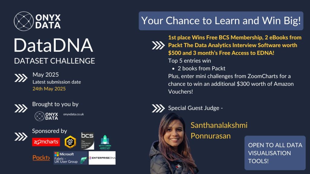
Prize Pool: BCS Membership, 2 eBooks from Packt,The Data Analytics Interview Software worth $500 and 3 month’s Free Access to EDNA!
Mini challenges from ZoomCharts for a chance to win an additional $300 worth of Amazon Vouchers!
You are a data analyst for a major mobile phone retailer operating across multiple countries. You’ve been given a 2024 sales dataset, containing detailed records of mobile phone transactions, customer demographics, product specifications, and geographic locations. The dataset combines information about the models sold, their prices, storage sizes, colors, operating systems, and customer demographics like age group and gender. It also captures where and how the sales were made – online, through partners, or in-store, and the type of payment used.
Your goal is to build a report that tells the story of mobile sales across different regions, highlights best-selling products and trends, and helps the business understand customer behavior better.
You'll receive a confirmation email immediately with links to your portfolio entry and profile.
2
AI feedback within 30 minutes
Your work is scored across storytelling, design, technical depth, and insights. Detailed feedback arrives by email.
3
Scores on your portfolio
A draft portfolio entry is created automatically. Once you publish it, your AI scores appear on your public profile and the portfolio gallery.
4
Certificates for winners
Certificates are emailed to winners after the challenge closes and results are finalised.
Please note: Resubmissions are not permitted, to ensure fairness for all participants.
Submission received
Your entry to the May 2025 DataDNA – Mobile Phone Sales challenge has been recorded.
What happens next
AI feedback — A personalised feedback email will arrive within 30 minutes, scoring your work across storytelling, design, technical depth, and insights.
Portfolio entry — A draft portfolio entry has been created. Visit your Edit Profile page to review and publish it.
Scores — Once published, your AI scores are visible on your public profile and in the portfolio gallery.
Please note
Resubmissions are not permitted — this ensures fairness for all participants.
Certificates are emailed to winners after the challenge closes.
Check your spam folder if you don't see the feedback email within 30 minutes.
Step 3. In your post, share an image of your visualisation or dashboard (remember, it must be a single image).You can directly click on below button directly to share !
Business users use reports to make data-driven decisions. That’s why reports are called effective if they enable users to drill down and filter data quickly and intuitively to find answers to any question they might have and analyze data in all possible directions and dimensions.
We will evaluate:
1) How easy is it to understand the data? (Max 10 points)
Is too much text used for explanation?
Are the indicative colors in charts instinctually understandable?
Does it tell a story?
2) How easy-to-use is the report? (Max 14 points)
Cross-chart filtering implementation across the report. Can other visuals provide relevant data as the user explores the report?
Response time
Drill Down: Multi-layer data exploration. Can the user drill down and gain additional insights within the report?
Use of tutorial overlays and other elements to assist new users. Can a new user start using this report straight away with just the guidance provided within the report itself?
3) How good is the report design and is it suitable for its purpose? (Max 10 points)
Visual design: Is the overall look consistent, no empty spaces, no overcrowding?
Interface design: Are there unnecessary visualizations/buttons/complexity in use?
UX design: Is the produced report usable?
Report design: Is the main challenge answered?
Technical: Are all the fonts used the same, are the sizes readable?
You are encouraged to use various techniques at your disposal, such as tooltips, drill-throughs, drill-downs, cross-chart filtering, and page navigation features, to enhance your analysis.
Resources
Here are some useful links to learn more about ZoomCharts and get inspiration for your report:
Use-Case Gallery: Try live demos and download reports made by the ZoomCharts team.
Video Tutorials: Watch engaging video guides on how to set up and use the visuals.
Documentation: Technical deep-dive about ZoomCharts visuals.
ZoomCharts Blog: Useful tips & tricks for data visualization and report creation.
Visuals Gallery: Explore all the possible customization options for Drill Down Visuals.
Upcoming Webinar
No upcoming webinars available.
Past Webinar
Top 5 Pharmacy Sales & Profitability Reports: Power BI Best Practices Review
In this challenge, you will analyze an operational dataset from a global maritime logistics company managing cargo movements across international terminals. The data includes cargo transactions by terminal and vessel, with supporting dimensions for time, regional hub (EMEA, APAC, AMER), vessel category, and operations.
Your objective is to identify the impact of the 2021 Suez disruption, uncover infrastructure bottlenecks, and detect efficiency anomalies — helping leadership reduce cargo movement times by 15% through data-driven terminal optimization.
In this challenge, you will analyze a dataset representing a European pharmacy chain distributor operating across multiple European countries. The dataset includes daily sales transactions by pharmacy and product, with supporting dimensions for time, geography, and product hierarchy.
December 2025 DataDNA – Animal Shelter Operations Challenge
December 2025
In this challenge, you will analyze the Animal Shelter Intakes and Outcomes dataset from the City of Long Beach Animal Care Services. The dataset includes detailed information about each animal entering or leaving the shelter, such as species, intake type, condition, outcome type, and length of stay.
November 2025 DataDNA – E‑commerce Analytics Challenge
November 2025
E-commerce Analytics Challenge
Step into the role of a data analyst at a global software retailer that sells analytics, design, collaboration, and AI subscriptions. Your mission is to uncover what drives customer loyalty and identify which channels and campaigns lead to repeat purchases.
October 2025 DataDNA – Consumer Financial Complaints Analytics Challenge
October 2025
Consumer Financial Complaints Analytics Challenge
Step into the role of a data analyst at the Consumer Financial Protection Bureau (CFPB), a U.S. government agency ensuring fairness and accountability in the financial sector.
The CFPB collects complaints from consumers across the United States regarding financial products and services. Each complaint is tracked from submission through company response.
September 2025 DataDNA – Credit Risk Analytics Challenge
September 2025
In this challenge, you’ll act as a credit risk analyst at Nova Bank, a financial institution that provides personal, medical, education, and business loans across the USA, UK, and Canada. Nova Bank wants to make lending fair and accessible while also protecting itself from unnecessary risk.
– Share a LinkedIn post with your visualization image and tag @OnyxData,@SmartFramesUI, @DataCareerJumpstart and @packt with #dataDNA.
– Share an image of your visualization or dashboard (single image only).
– Complete the entry form listed.
Only one entry is accepted for the challenge. After your first entry, no further entries will be accepted.
The challenge is open to all BI and data visualization tools.