Join a community of the most creative Business Intelligence Professionals
Join a community of the most creative Business Intelligence Professionals
Find data professionals with skills verified through real challenge performance.
Browse Talent DirectoryCreate realistic synthetic data for training, testing, and demonstrations.
Explore Dataset Generator
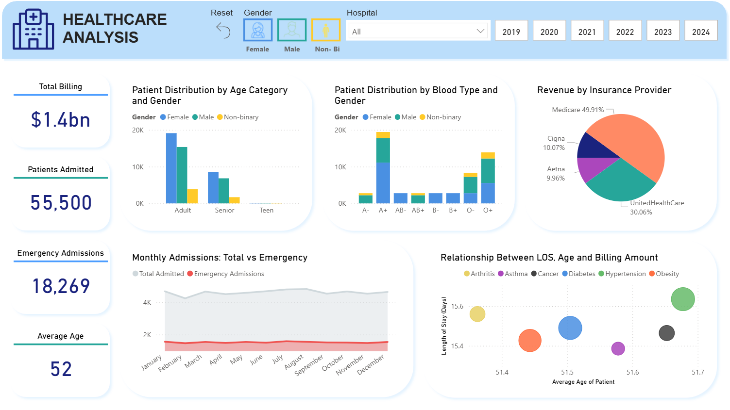
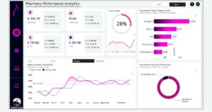
About this project Healthcare Analysis Dashboard (Onyx Data April Challenge - Power BI) Developed an interactive Power BI dashboard as part of the Onyx Data April Challenge, analyzing a comprehensive healthcare dataset. This 5-panel visualization provides actionable insights into patient demographics, billing, and operational efficiency, featuring dynamic filters for gender, hospital, and year (2019–2024). Key Features: Billing & Admissions: Displays $1.4 billion in total billing and 55,500 patients admitted, with 18,269 emergency cases. Demographics: Illustrates patient distribution by age (e.g., adults dominate) and gender, with an average age of 52. Revenue: Breaks down $1.4bn by insurance, with Medicare at 49.1%, followed by UnitedHealthCare (30.0%), Cigna (10.07%), and Aetna (9.96%). Blood Type & LOS: Shows patient distribution by blood type and gender, alongside a 15.4-day average length of stay (LOS), correlated with conditions like arthritis, asthma, and diabetes. Trends: Tracks monthly admissions (total vs. emergency) and relationships between LOS, age, and billing amounts. Impact: The dashboard empowers healthcare stakeholders to optimize resource allocation and patient care through data-driven decisions. Built using Power BI and DAX, it showcases my ability to transform complex datasets into intuitive visualizations, honed during the challenge. Technologies: Power BI, DAX
 Dhia Salsabila Azhar
1
Dhia Salsabila Azhar
1
Contact our team

16 Upper Woburn Place, London, Greater London, WC1H 0AF, United Kingdom


 Nana Kwesi Safo